
There’s an ad floating around on Facebook for…um, I’m not sure what it’s for. Some kind of online relationship orientation test, I think? Anyway, the Facebook ad has an image that looks like this:
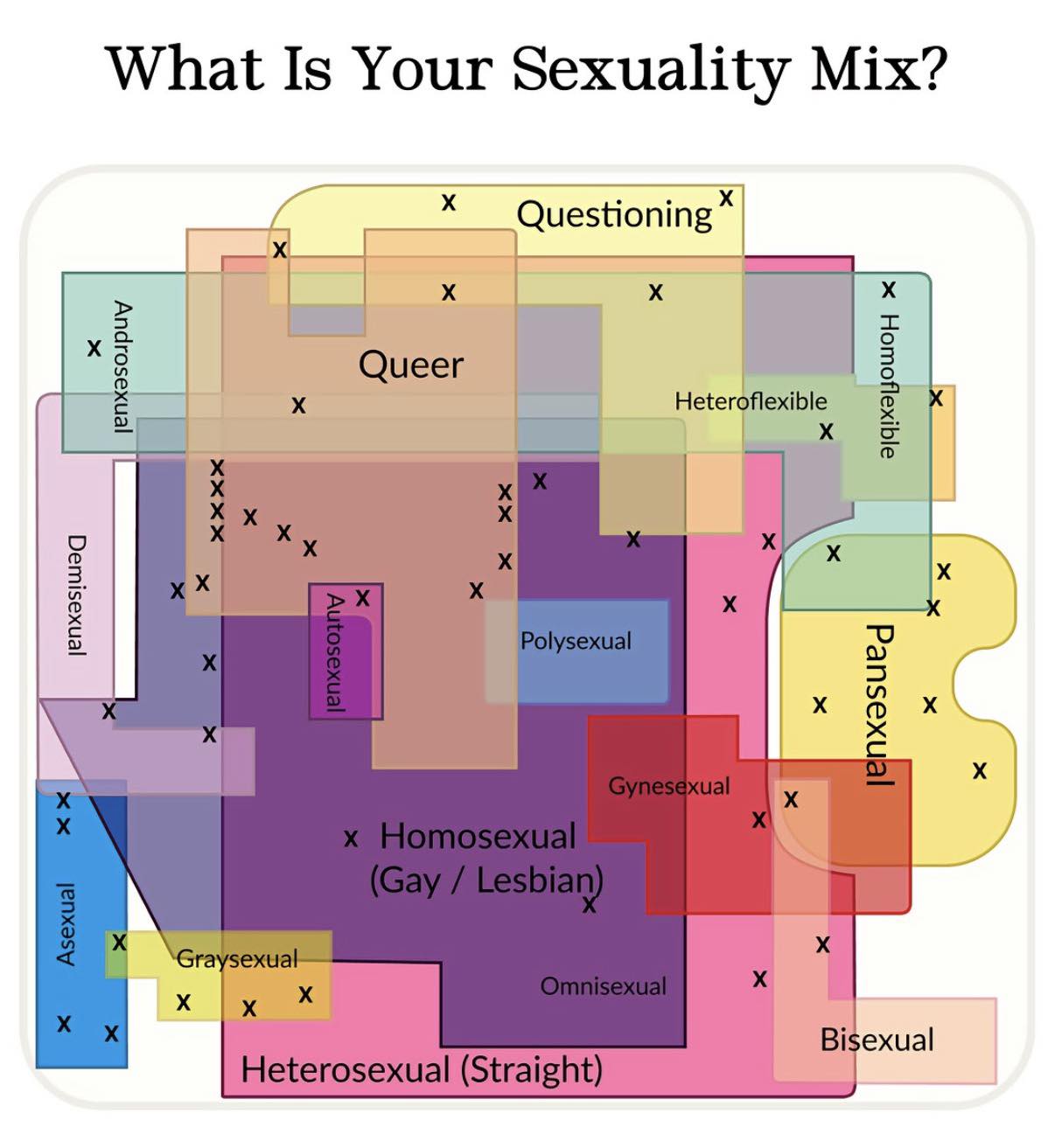
About a dozen people have sent me this image. It ended up on a Facebook group about shitty infographics.
If this image looks vaguely familiar, that’s because it is an AI re-imagining of an infographic I did about sixteen years ago:
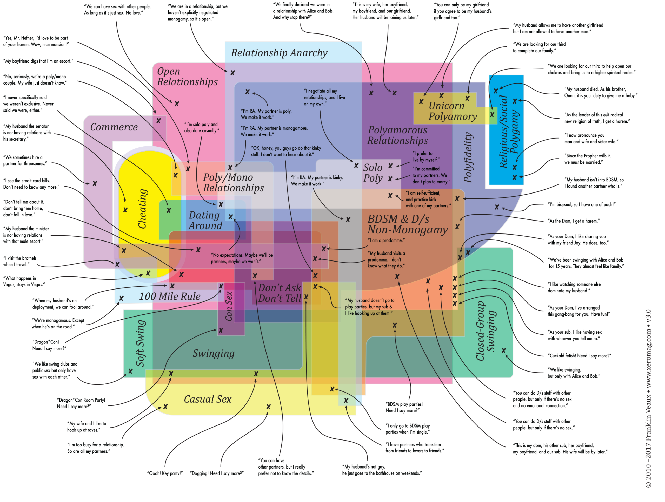
This is a Venn diagram (well, technically, no it’s not, it’s a Euler diagram, but most people think of intersection maps as Venn diagrams) of various types of non-monogamy. I made it into a poster and put it on my sexual informatics page and everything.
So the thing about the AI knockoff that’s being used in this ad is that the more you look at it, the less sense it makes, which is pretty much typical of AI graphics in general.
The Euler map I created took months to design, no lie. The intersections matter. There is, for example, a huge overlap between “casual sex,” “swinging,” “soft swing,” and “polyfidelity” (yes, there are polyfi groups that make exceptions for casual sex and swinging, but reserve committed relationships to the polyfi group). The shapes of the areas mean something.
If you look at the advertising image, it’s absurd. Why is there a cutout in the “pansexual” shape? Why does it intersect with homoflexible but not heteroflexible…are they saying you can be pan if you’re mostly gay but not if you’re mostly straight? Why do homosexual and heterosexual almost entirely overlap? And why the little unlabeled Xes?
Okay, I know the answer to the last part. The AI scraped the graphic from my sexual informatics page. The Xes are popups you can touch or mouseover. The AI didn’t see the popups, it just assumed that since it scraped a sexual informatics map with Xes on it, Xes belong on sexual informatics maps, LOL.
The point is, AI output isn’t information. It’s an information-shaped hole. AI LLMs and image generators create stuff that looks like content but isn’t really content. They see “shapes overlapping” but do not understand the meaning of the overlaps, so they make overlapping shapes without meaning.
It frightens me that people who do Google searches are now starting to look only at the AI summary at the top of the page, without even looking at the search results. The AI summary is flat-out wrong an astonishingly high percentage of the time.
The thing about infosec is that the whole history of infosec is the gradual realization that people are sometimes malicious, so a computer must never, ever, ever trust anything that comes from a user without sanitizing it. Yet LLMs shovel all kinds of user-generated content into their gaping maw without fact-checking or sanitization.
This means LLMs often produce wrong output, but worse, it also means that malicious actors can trick AIs into producing malicious output.
I’ve discovered an organized scam group spending a huge amount of effort producing content designed to trick Google Gemini into giving advice that causes people to fall for the scam.
AI image and LLM generators are frightening, but not for the reasons people think. They aren’t intelligent (yet), they do not understand the world or even that the world exists, but they sound authoritative, so people trust them. And they’re easy to corrupt and easy to manipulate, so bad actors can make them say malicious things.
Interesting times indeed.