Apple and the FBI. It’s the Rock ‘Em Sock ‘Em Robots fight that the movie Alien vs Predator should have been, but unlike Alien vs Predator, this one so far has failed to disappoint.
On one side, we have a giant tech megacorp that makes cellphones. Also other stuff, I hear, but these days mostly cellphones. On the other, we have the full force and might of the United States Government, in the form of the Federal Bureau of Investigation. In between, we have: Terrorists! Encryption! Civil liberties! Donald Trump spouting off!
The Internet is filled with conversations about the spat, much of which are either not technically correct or overtly technical. It’s my goal here to try to explain a very complex situation in a way that doesn’t require a high level of technical mastery. However, this is a technical issue, so there will be some geeky bits.
The Background
Last year, a couple of assholes named Syed Rizwan Farook and Tashfeen Malik decided they were going to express religion of peace by blowing away a bunch of people in San Bernardino, California. They decided, you see, that something something holy war something martyr God, and something something kill people whatever…I don’t know or particularly care about the details, and they’re not really relevant here. So far, so boring: some yahoos think there’s an invisible dude in the sky who wants them to kill some other people, it all ends in tears–a story that’s been playing out with minor unimportant variations since the dawn of civilization. The FBI investigated and decided they were “homegrown extremists” (no idea if they were organic or GMO-free) and not affiliated with any other terrorist groups or cells.
This is the part where things get interesting.
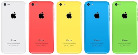
During the investigation, the FBI discovered that the yahoos had Android smartphones, which they destroyed prior to going on their rampage of murderous idiocy, and that one of them had an iPhone 5C provided by the company he worked for.
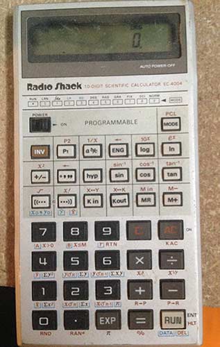
This is the logic board from an iPhone 5c. Like all iPhones, the user data on an iPhone 5c is encrypted. You need to unlock the phone in order to get at its contents. By default, the phone is locked with a 4-digit numeric code. If you don’t enter the code, the phone’s contents remain encrypted.
You can’t just read the information from the phone’s flash memory, because it’s encrypted. The FBI wants to read the contents of the phone, for reasons that aren’t clear to me (if there was anything sensitive on it, it’s hard to imagine he wouldn’t have smashed the phone before running off to kill people who had nothing to do with whatever grudge he imagined his invisible sky-man carried, like he did with his other phones), but whatever.
The FBI tried to read the phone’s contents, and discovered that the iPhone is actually rather secure. If you want to know the full details of how secure, there’s a PDF on Apple’s iPhone security here.
So they went to Apple.
This is where things get really interesting, and a lot of the conversation about the situation gets some important facts wrong.
The Problem
The iPhone’s files and such are encrypted. This is not simple home-grown encryption, either; it’s military-grade 256-bit AES encryption. It can not be defeated by any known attack. All the world’s computers combined would take about a billion years to brute-force the encryption, which is a bit more time than the FBI prefers to spend on this.
Now, there are some important things to understand here.
One is that nobody can break the encryption, not even Apple. Apple has no secret back doors or master passkeys to get at the contents of a locked phone, and that’s not (exactly) what the FBI is asking them to do.
The other is that the four-digit code you type into an iPhone is not the encryption key. The encryption key is made up of a secret, random number embedded into each phone at the moment of manufacture, combined with the passcode you set by means of some arcane mathematics that are beyond the scope of this blog post. Apple does not know the encryption key; they do not have a way to set the unique hardware number, and in any event it’s all tangled up with the passcode the user enters in order to create the encryption key anyway.
So here’s where things sit: The phone’s contents are encrypted. The FBI wants access to the phone for whatever reason. Apple can’t decrypt the phone. So what’s the deal?
The Tussle
The fact that the phone in question is an iPhone 5c is really, really important. If it had been a 5S or a 6, it wouldn’t matter, because Apple made a change in the inner workings of the later phones to prevent it from being asked to do precisely what it’s being asked to do.
So, here’s how it works.
iPhones run an operating system called iOS. iOS is digitally signed; that means Apple has a secret encryption key it embeds into iOS. The phone carries a special, immutable boot ROM that contains the decryption code for this key. If it starts to boot and sees an operating system not signed by Apple, or if the operating system is tampered with in any way, the phone refuses to boot. (This is different from and not related to jailbreaking an iPhone. Even a jailbroken phone will not boot a copy of iOS not signed by Apple.)
What does that mean? It means nobody on earth–literally–can make an operating system the phone will boot, except for Apple. If the FBI or anyone else tries to modify the iOS boot loader, the phone will not boot. Only Apple knows the key needed to change the iOS boot loader.
Now, a few other things you need to know about how an iPhone works.
If you type the wrong passcode into an iPhone, the phone lets you try again. If you get it wrong again, the phone lets you try again, but after that, things start getting harder. The phone starts introducing a delay before you can try again. That delay gets longer and longer the more you enter the wrong code. By the ninth time you enter the wrong code, the phone refuses to allow you to try again until an hour has passed.
There are 10,000 different possible combinations of four digits. If you can only try one per hour, it will take you more than a year to try them all. Good luck trying to brute force the passcode!
There’s another complication too. If you get it wrong 10 times, the phone wipes itself.
Here’s where the 5c thing gets important.
Starting with the iPhone 5S, Apple introduced the “Secure Enclave.” The Secure Enclave is a special chip (well, actually, it’s a special section of the processor chip) that has its own memory. It’s basically a tiny, highly secure, tamper-resistant computer.
The Secure Enclave keeps the phone’s decryption key in its own special memory and talks to the phone over a special-purposes, encrypted communication link. The rest of the phone does not know, or have access to, any information stored in the Secure Enclave.
When you enter the passcode, the phone sends the passcode to the Secure Enclave. The Secure Enclave says “yes” or “no” about whether the right code was entered. If the right code was entered, the Secure Enclave decrypts the phone. If it wasn’t, the Secure Enclave refuses to do so. It also starts a timer. While the timer is running, the Secure Enclave refuses to process any more passcode requests. That timer runs for longer and longer as you keep entering the wrong code. If you enter the wrong code 10 times, the Secure Enclave wipes the encryption key from its own memory and that’s it, you’re done. Trying to get at the phone’s contents after that means you’ll be banging away at it until the stars burn out.
But… This is not an iPhone 5S or later, it’s a 5c!
On the 5c, the time delay and wiping the phone are not handled by the Secure Enclave, they’re handled by the operating system. The operating system enforces the longer and longer delay and the operating system wipes the phone if you enter the wrong code 10 times.
The Secure Enclave is a bit of hardware that can’t be tampered with. But the operating system can be changed. So if you have an older iPhone, you could, in theory, put a different version of iOS on it. A special version, with the timer and the phone wipe disabled.
Except, oh no you can’t, because the phone will not run an operating system that isn’t signed by Apple.
So the FBI wants Apple to create a new version of iOS. A modified version that has no time delay if you get a wrong passcode and no phone wipe. And then they want Apple to sign it and put that new version of iOS onto the phone.
This will not give them the contents of the phone. What it will do is let them try passcode after passcode as fast as possible until they break in. Without a phone wipe, they can keep trying as many times as it takes. Without a delay, they can try all 10,000 combinations in days or weeks instead of years.
Of course, there’s an added wrinkle to all this. The FBI already has a copy of the phone’s data.
iPhones come with a subscription to Apple’s cloud service, iCloud. iPhone users can choose to have their data backed up to iCloud. The backup feature was turned on on this phone. The FBI asked for, and got, a copy of the phone’s data backed up on iCloud.
Unfortunately, the copy they got is out of date. They screwed up and asked the company that owns the phone to change the iCloud password in order to have a look at what was there. The company complied. The FBI looked at the iCloud backup. Then they turned on the iPhone. The iPhone couldn’t make a new backup to the cloud…because the password had been changed. The FBI thinks it’s possible there’s information on the phone that’s newer than the information in the cloud backup. They’re not sure, though, because…they can’t get into the phone.
The Rationalization
If an iPhone were a safety deposit box and Apple had the key, the government would normally just issue a subpoena for Apple to produce the key, assuming they didn’t just take a blowtorch to the box and be done with it.
But that’s not what the government has done here. They can’t subpoena Apple to produce the encryption key or the passcode because Apple does not have and can not get the encryption key or the passcode, and Apple has no magic backdoor.
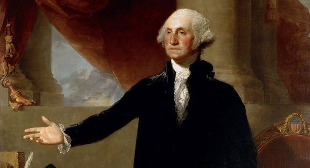
So instead, they’ve turned to the All Writs Act of 1789, a law signed by this dude.
The All Writs Act is a law that allows the government to issue “all writs necessary or appropriate in aid of their respective jurisdictions and agreeable to the usages and principles of law.” Essentially, it lets Federal courts issue orders to private citizens in order to accomplish legal ends. A writ was originally a written order given by a monarch to a citizen compelling the citizen to do something. The way it’s used in the All Writs Act, it’s an order from a court compelling a citizen to do something.
Like, for example, write a new operating system. Because the court says so.
The All Writs Act was signed into law before the Bill of Rights existed. The Bill of Rights would seem to put some limits, at least, on what the government can order people to do. In this case, the FBI thinks that ordering a company to write a piece of software is within those limits.
It should be noted that this isn’t a matter of commenting out a few lines of code and hitting “compile.” There are, for good reason, legal guidelines that must be followed when writing investigatory forensic software. These legal guidelines are necessary to preserve the chain of evidence and show in court that the software didn’t modify the information on the device being investigated. The standards are fairly complex and are outlined on this page on the Digital Forensic Investigator Web site.
Basically, the gist of it is the software must be documented, must be subject to peer review, must be tested on target devices similar to the device being investigated to show that it works and won’t corrupt, delete, or modify information, and must pass independent judicial review of its reliability.
So basically, the FBI is asking Apple to go to considerable trouble to build a new operating system, test it, document it, submit it for examination, and load it onto an iPhone 5c, for the purpose of allowing the FBI to keep trying all 10,000 possible passcodes until they finally unlock it. They’re using a law written before the Bill of Rights existed that authorizes Federal courts to issue orders to private citizens to do this. Basically, the All Writs Act says “the government can order people to do any legal thing.” It has zero to say on the subject of what constitutes a “legal thing.”
The Real Battle
The FBI wants Apple to create a new version of its operating system, with certain key security features disabled, and load it onto the phone so that its passcode can be brute-force hacked and the contents read. They’re not asking Apple to decrypt the phone; Apple can’t do that. They’re not asking Apple to provide the passcode; Apple can’t do that either. They’re asking for a new operating system.
Would this new operating system allow them to get at any locked phone? No, it would not. iPhone 5s and later models have these security features in hardware, etched in silicon on the Secure Enclave. A new operating system can’t change that.
So what’s the big deal? Is Apple coddling terrorists, like the FBI director implies and Donald Trump spouts all over Twitter from his iPhone?
No. As with an argument between two lovers that ultimately ends in divorce, this fight is’t really about the stuff this fight is about. This fight isn’t about a work phone that used to belong to a terrorist asshole and probably contains fuckall of interest to the FBI. The terrorism angle is a convenient excuse, because the word “terrorism” is kind of magic spell that causes a whole lot of people (including, bizarrely, conservatives whose entire political philosophy is built on the foundation of distrusting the government) to take leave of their senses and do whatever they’re told.
But this fight isn’t about this phone.
Washington is afraid of encryption. Much as gun lovers and survivalists love to think Washington is afraid of their guns (which is laughable in its absurdity–the military has way more guns than you do, Tex), Washington is afraid of encryption.
This fight has been a very long time coming. The government has always hated and feared encryption, even as it has invested tremendous resources in making encryption better.
In the early 90s, the US passed laws banning export of encryption products. I still own a T-shirt that was legally classified as a “munition” back then, and that you could be arrested on Federal charges for wearing outside the US or showing to foreign nationals, because it’s printed with source code for encryption software. Finally, in 1996, Bill Clinton scrapped laws against exporting encryption software, largely because they were hurting US businesses overseas, and besides, the Russians already had strong crypto because–surprise!–they had mathematicians too.
The fear of the Russkies has faded into nothing–there’s an entire generation now old enough to read this blog post that grew up with the Cold War being something you read about in history books, not something you lived through. Now, the bogeyman du jour is terrorists, or maybe pedophiles, or hell, why not both?
Police don’t like locked phones and encrypted comms, and Congress has been wrestling with what to do about that for years.
The government has mulled banning strong encryption. Not just the US government, but every government. China wants to ban it. France just debated banning it. India is planning to ban it. The UK wants to ban it. Congress has considered banning it no fewer than three times in the last two years.
The arguments are always always the same: If people can talk without the government listening, the terrorists win. Or the pedophiles win. Or the pedophile terrorists win. Law enforcement can’t do its job without being able to see what’s on your smartphone, because reasons.
Apple argues that if the government succeeds in ordering it to write a new version of iOS to help them get onto this phone, they will feel free to order it to write other software for them as well. Write us software to let us turn on this suspect’s cell phone camera and microphone remotely! Write us software to make copies of this suspect’s email! No legal principle exists that would limit the authority of the government’s ability to order Apple to do things like this.
And that’s a nice, cuddly government filled with the milk of human kindness, like the US government believes the US government is. If Apple has the ability to do these things and can be compelled to do so, the Chinese will really like that. Apple argues that if the FBI succeeds, it will basically have to create a whole new software department–call it the Department of Undermining Our Security Department–to handle the flood of orders coming in to write custom software to disable this or that or the other security feature. And they might be right.
The government says nobody else will get this hacked iOS version (or versions, if other requests start rolling in). Apple says that’s naive. Hard to say what’s scarier, the FBI with rogue Apple-signed iOS software, the Chinese with rogue Apple-signed iOS software, or rogue Apple-signed iOS software leaking into the hands of organized crime.
There’s also the very real possibility that if the government has success here, sooner or later it will realize that a terrorist using an iPhone 6 will still be able to secure a phone in a way that neither Apple nor the government can do anything about, and start calling on Apple (and other companies) to weaken their encryption. The Secure Enclave with its hardware timer and self-vaporizing key is pretty damn secure. What happens if the government decides to tell Apple to tone things down a bit for the iPhone 7? That’s not impossible, and if Apple can be forced to write a new operating system to help law enforcement, changing the design of their chips to help law enforcement is a doddle.
Encryption is math. Math is math; math doesn’t care about bad guys or good guys or legal oversight. If there is a way to slip past an encryption method, that way works for everyone, good guys and bad guys alike, because math is math and math doesn’t care. If it works for the FBI, it works for Igor in the Russian mafia as well.
So that’s what’s going on, and that’s what’s at stake. It’s a problem that doesn’t readily boil down to sound bites or Tweets, and that means, I fear, that the public won’t really understand what’s happening until it’s been decided for them.


 It’s been a bad week for WordPress. If you’re a WordPress user, I highly recommend you check as soon as possible to ensure your site is updated, all your plugins are up to date, and your site is free of unexpected users and malicious combat.