
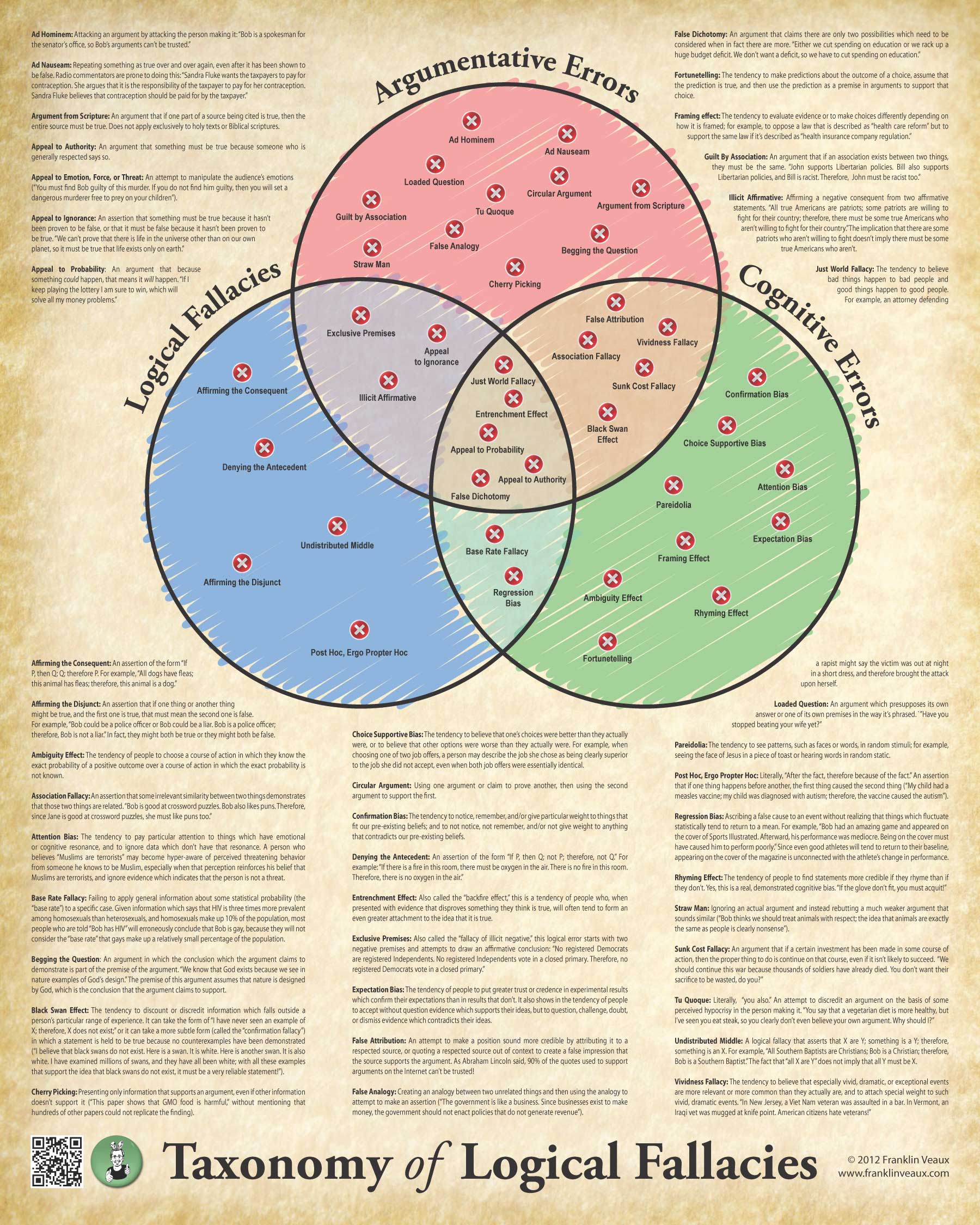
Okay, here’s the third (and, with luck, final) go-round.
I’ve alphabetized all the definitions and done some tweaking of some of them. I think this makes for a much easier to read poster, though one consequence of doing that is there’s a definition in the right-hand column that is broken. Sorry, not much I can do about that.
I’ve also gone back to the parchment background. I tried a number of different styles of background, from metal to abstract swirly things, and I don’t think any of them work nearly as well. However, the observation that the parchment doesn’t really fit with the modern sans-serif typeface on the title is a good one, so I’ve changed the typeface on the title (and on the names of the circles in the Venn diagram).
I think this is pretty close to the final design. Let me know what you guys think!
As usual, clicky the image to embiggen.
Looks awesome!
Looks awesome!
This is REALLY sexy. I wish I could afford to find out how many classrooms there are in the local high school and order enough to post one in each room. They have to learn critical thinking skills somehow. I’ll order one for my son’s room at least,
This is REALLY sexy. I wish I could afford to find out how many classrooms there are in the local high school and order enough to post one in each room. They have to learn critical thinking skills somehow. I’ll order one for my son’s room at least,
I’m not seeing this in your store.
Also, any chance of a bundle with the human sex map?
Nope, it’s not actually up in the store yet. I still want to have a test print made and suchlike. Soon!
*whines*
Please post an update when you’ve decided it’s good enough and it’s up in the store.
I’m not seeing this in your store.
Also, any chance of a bundle with the human sex map?
Nope, it’s not actually up in the store yet. I still want to have a test print made and suchlike. Soon!
*whines*
Please post an update when you’ve decided it’s good enough and it’s up in the store.
Lovely! On reflection, I do like the parchment background better than the grey one.
Lovely! On reflection, I do like the parchment background better than the grey one.
Curious as to why the “pen scribbles” for the colouring. It looks distracting, to me. We have hard-edged circles, perfectly aligned text… and then scribbles.
I like that part, as it has a certain whimsical poetry, considering the contents of each area of the diagram. Also, if each one were solid, the whole thing would be more visually boring. I think it draws interest from afar this way.
I actually tried it with plain circles first, and the result was…underwhelming. Visually, it didn’t create interest. I did a few variants (such as with the black outlines roughened as well), and the scribbles created what I thought was the best look.
Curious as to why the “pen scribbles” for the colouring. It looks distracting, to me. We have hard-edged circles, perfectly aligned text… and then scribbles.
I’m not fond of the broken-image-looking Xs myself. Are Xs even really necessary?
(But this is so cool. And I will buy one.)
I’m not fond of the broken-image-looking Xs myself. Are Xs even really necessary?
(But this is so cool. And I will buy one.)
Definitely like the parchment better & the serif fonts for the titles look more tied-together too!
Definitely like the parchment better & the serif fonts for the titles look more tied-together too!
I like that part, as it has a certain whimsical poetry, considering the contents of each area of the diagram. Also, if each one were solid, the whole thing would be more visually boring. I think it draws interest from afar this way.
You’ve probably wrestled all over with column widths and breaks and spacing, but someone in graphic design may have a suggestion you haven’t thought of as far as bending or breaking a rule to avoid splitting a definition across two text blocks (right side). Could involve kerning or changing your assumptions about uniformity somewhere it won’t be noticed.
Easter egg colors are fun with the bunny ears.
I’ve actually done quite a bit to try to prevent the break, including changing kerning and letterspacing, and it doesn’t seem like it’s realistically going to happen. I think the advantage of alphabetizing the definitions makes up for it, though.
You’ve probably wrestled all over with column widths and breaks and spacing, but someone in graphic design may have a suggestion you haven’t thought of as far as bending or breaking a rule to avoid splitting a definition across two text blocks (right side). Could involve kerning or changing your assumptions about uniformity somewhere it won’t be noticed.
Easter egg colors are fun with the bunny ears.
Hey, I just started reading some of the copy, and some of the definitions seem like they need work/review. Have you run this by a herd of freshman philosophy students yet? Generally though, the examples seem like they are intended to be useful or funny.
You also might want to say somewhere that this isn’t a complete list of all possible logical fallacies.
Well, I’ve ordered a proof, so if you have any ideas for reworking the examples now’s the time! 🙂
Hey, I just started reading some of the copy, and some of the definitions seem like they need work/review. Have you run this by a herd of freshman philosophy students yet? Generally though, the examples seem like they are intended to be useful or funny.
You also might want to say somewhere that this isn’t a complete list of all possible logical fallacies.
Make sure you bring a bunch to Dragon*Con to sell, and put a flyer or something on the Skeptical Resources stand that I’m bringing to set up in the Skeptrack!
Make sure you bring a bunch to Dragon*Con to sell, and put a flyer or something on the Skeptical Resources stand that I’m bringing to set up in the Skeptrack!
I actually tried it with plain circles first, and the result was…underwhelming. Visually, it didn’t create interest. I did a few variants (such as with the black outlines roughened as well), and the scribbles created what I thought was the best look.
I’ve actually done quite a bit to try to prevent the break, including changing kerning and letterspacing, and it doesn’t seem like it’s realistically going to happen. I think the advantage of alphabetizing the definitions makes up for it, though.
Well, I’ve ordered a proof, so if you have any ideas for reworking the examples now’s the time! 🙂
When can we buy this printed poster-size?
I have a proof being shipped to me right now. If all looks good, it’ll be available starting next week!
When can we buy this printed poster-size?
I have a proof being shipped to me right now. If all looks good, it’ll be available starting next week!