
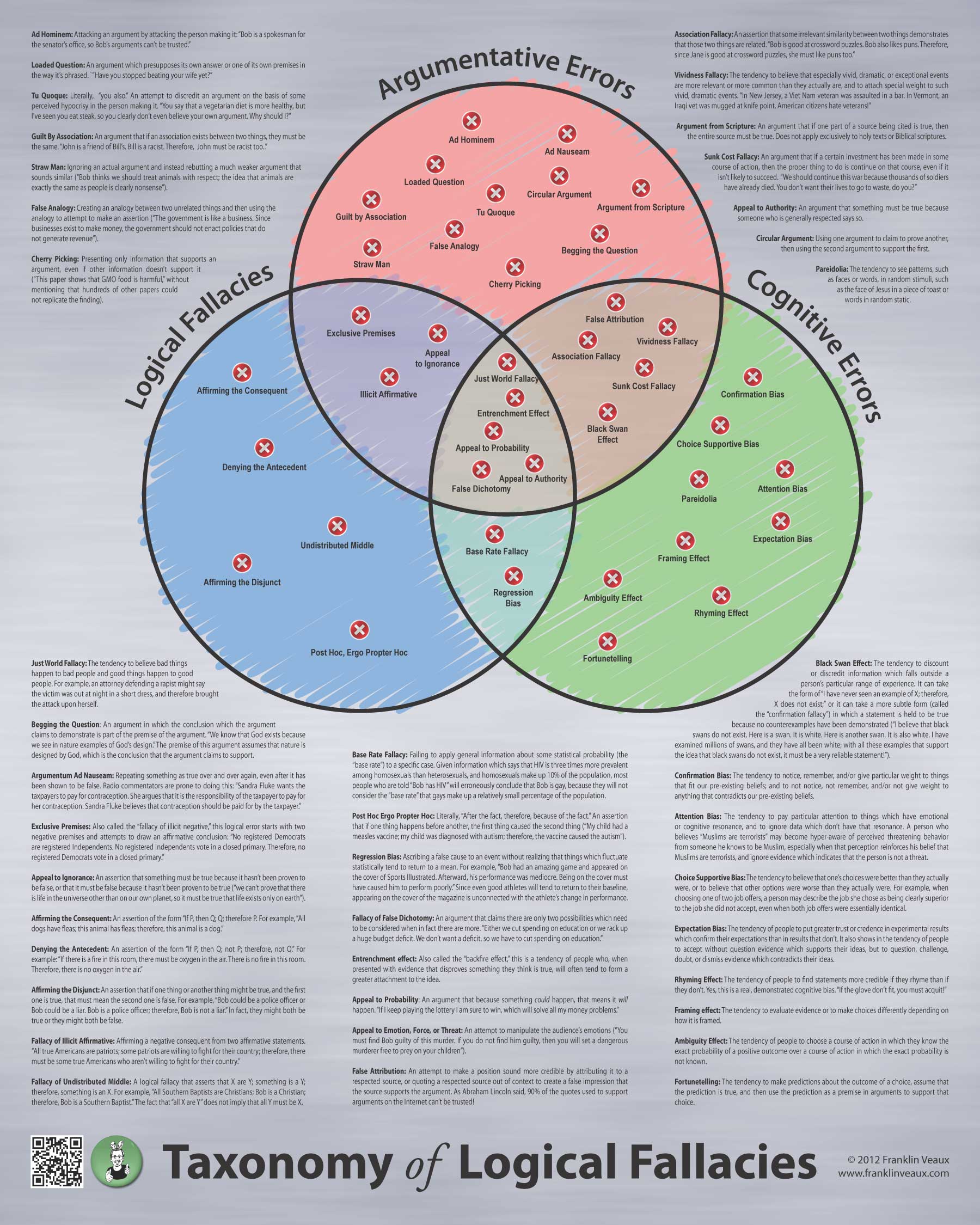
Here’s the second go-round of the poster version. As usual, clicky the picture for a much, much, MUCH bigger version. I’ve made some changes based on feedback I’ve gotten in my LJ and in email.
This version has a metallic background, which might be more in keeping with the look of the design than the parchment, but I’m not sure if I’m so crazy about. The columns have been adjusted so that no definition breaks, and I’ve removed the icons from the circles.
I experimented with several ways to try to indicate on each definition which part of the chart it falls into, using different colors, icons, and bullets, and it all ended up looking cluttered…which is too bad, because I think the poster would benefit from it. But it’s very dense as it is, and struggling with competing requirements of even text alignment, having no definition break, and trying to color-code or tag the definitions was a bit much.
As usual, click the image to embiggen.
Edit: A third revision is now up here.
I liked the parchment background better, other than that, looks good!
I liked the parchment background better, other than that, looks good!
Looks awesome!
But… Consider making the logical fallacies alphabetical for easier reference?
Alphabetizing the list definitely made it easier to read, though at the cost of being forced to break one of the definitions across the gap. The updated version is at http://tacit.livejournal.com/377994.html
Looks awesome!
But… Consider making the logical fallacies alphabetical for easier reference?
The parchment background, definitely.
I’ve switched back to the parchment and made some other changes: http://tacit.livejournal.com/377994.html
The parchment background, definitely.
I’ve switched back to the parchment and made some other changes: http://tacit.livejournal.com/377994.html
Alphabetizing the list definitely made it easier to read, though at the cost of being forced to break one of the definitions across the gap. The updated version is at http://tacit.livejournal.com/377994.html