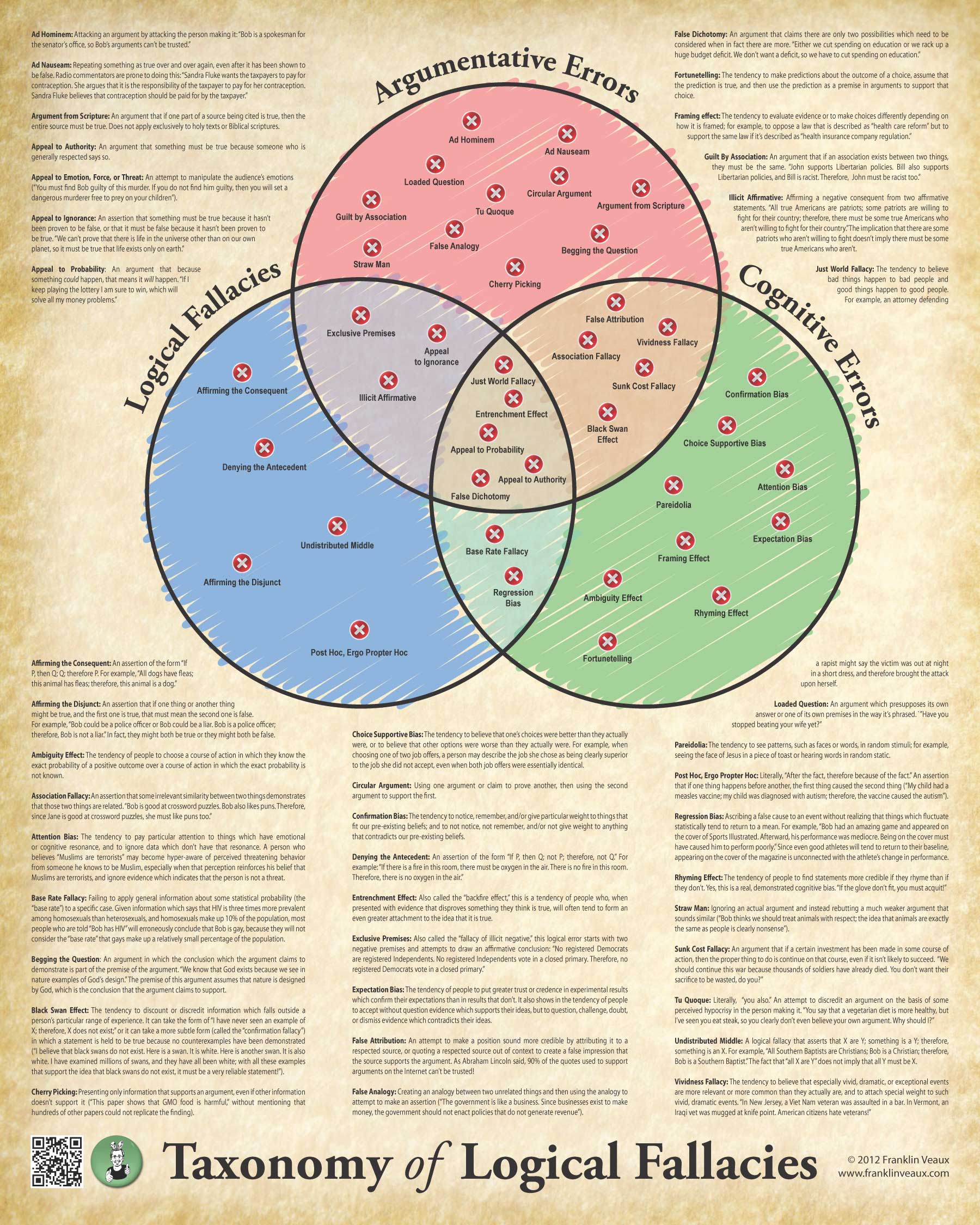
Okay, here’s the third (and, with luck, final) go-round.
I’ve alphabetized all the definitions and done some tweaking of some of them. I think this makes for a much easier to read poster, though one consequence of doing that is there’s a definition in the right-hand column that is broken. Sorry, not much I can do about that.
I’ve also gone back to the parchment background. I tried a number of different styles of background, from metal to abstract swirly things, and I don’t think any of them work nearly as well. However, the observation that the parchment doesn’t really fit with the modern sans-serif typeface on the title is a good one, so I’ve changed the typeface on the title (and on the names of the circles in the Venn diagram).
I think this is pretty close to the final design. Let me know what you guys think!
As usual, clicky the image to embiggen.